More Responsive Than Ever Before!
Do you like checking the status of your OBS account on the way to work? While sitting on the sofa? On a flight?
You are not alone  . Many of the OBS users like that, but the OBS web interface is often a pain in the neck, especially on
small screen sizes.
. Many of the OBS users like that, but the OBS web interface is often a pain in the neck, especially on
small screen sizes.
We want to change this. And with the new UI technology we introduced last year, we have the chance to do so!  So in the last couple of weeks, we have focused on improving the user experience following a mobile-first approach
(start the design of the page on a small screen, which has more restrictions, then expand the page features to create a tablet or desktop version).
So in the last couple of weeks, we have focused on improving the user experience following a mobile-first approach
(start the design of the page on a small screen, which has more restrictions, then expand the page features to create a tablet or desktop version).
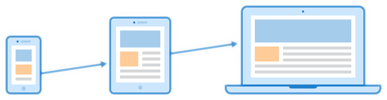 Figure: Mobile First Design - Author: Seobility - License: CC BY-SA 4.0
And this time we have pushed the first changes regarding improved responsiveness into our beta program. OBS now looks so much better on mobiles or tablets. Read on to know more details.
What’s New?
In general we have concentrated on…
- … making it easier to access to the most used options with one hand (more thumb friendly),
- … establishing a hierarchy in order to show the most important elements first,
- … minimizing the number of items shown on small devices,
- … making the most of the screen wide to not to waste space.
We adapted the specific areas like follows.
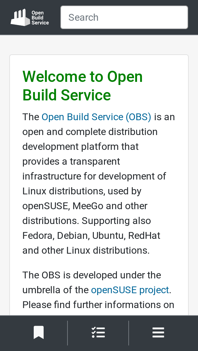
Navigation
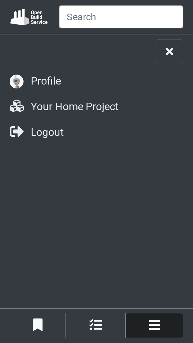
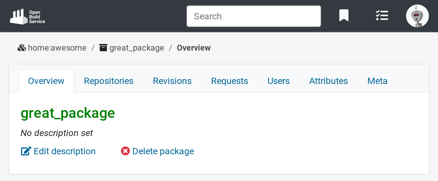
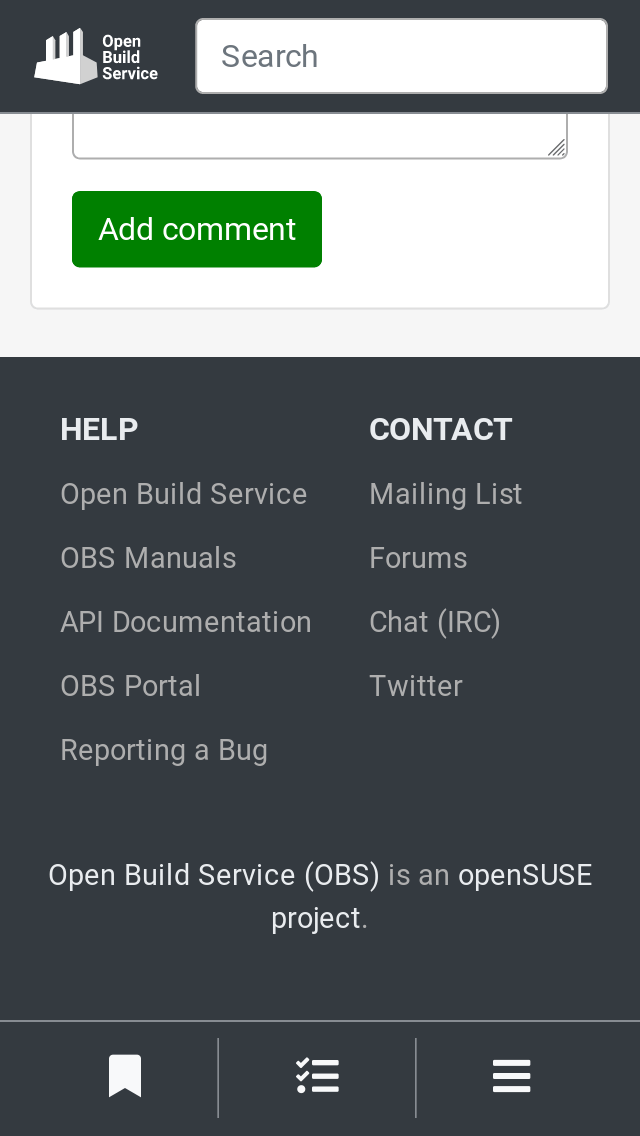
We started with the navigation that is included in the layout. For small viewports, a bottom navigation bar is displayed and contains the most important actions: Watchlist, Tasks and Personal Navigation.
Once the Personal Navigation is open, you can see links like Log in, Log out, Home Project or Profile inside.
For larger screens, the navigation is displayed on the top bar a bit different now.
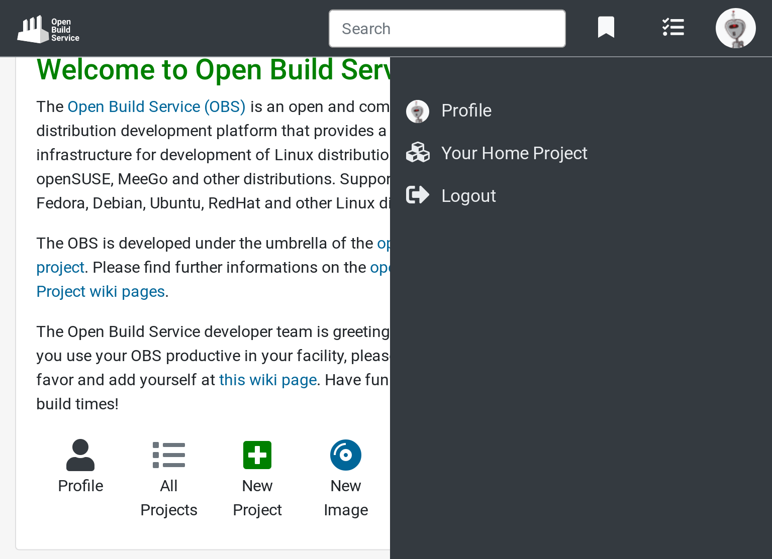
Another thing to highlight is that the search box is always visible on the top bar from now on. As you can see in the images above.
Breadcrumbs
In order to save some space, we simplified the breadcrumbs structure. We got rid of the house icon that pointed to the main page, after all, it is possible to go to that page by clicking on the OBS logo on the top-left corner. We also left out the link to all projects which hardly ever was used in the breadcrumbs.
Footer
As the screen becomes narrower, the number of columns shown in the footer decreases.
What’s Next?
With the issues in the layout addressed, we’ll focus on the content inside the individual pages in the future! 
Try It out and Give Us Some Feedback
As always, we need your feedback to make this even better. Don’t forget to join the beta program. first. Try the new features and tell us what you think about it.
There are two ways to reach us:
- On GitHub, by opening an issue and / or commenting on an already opened issue.
- On IRC, by talking directly to us. We are in the channel #opensuse-buildservice on Libera.Chat.
Please note that we favor GitHub to gather feedback as it allows us to easily keep track of the discussions.